D2L Redesign
D2L is an online learning platform for students that many educational institutions use across the country. As DePaul University students, our team focused on DePaul’s D2L platform.
Improving the Online Student Experience
Overview
TIMELINE
September 2022 - November 2022 (10 weeks)
ROLE
UX Researcher, UX Designer
TOOLS
Figma, Miro
Phase 1: Research
Our domain of inquiry for this project is understanding the DePaul student experience using the D2L platform. Our research aimed to discover how students use D2L, manage their courses, navigate within the platform and stay up to date with the deadlines.
Domain of Inquiry
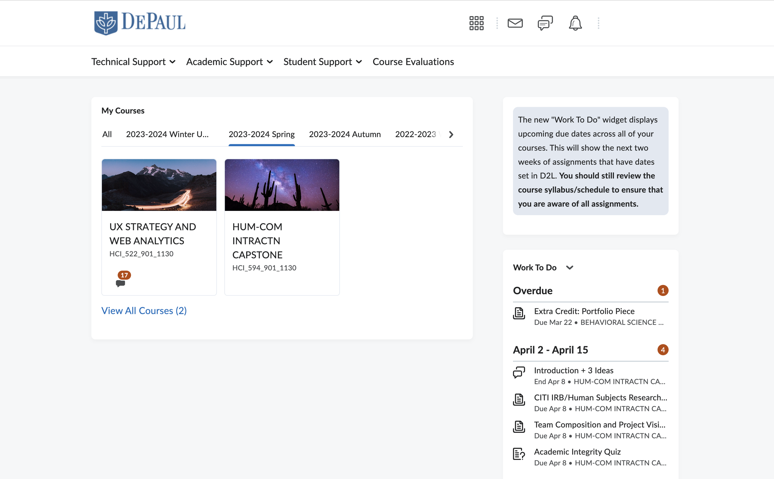
D2L: Current state
Interviews were conducted with 7 DePaul students, each from varying programs and with different forms of attending classes. We included questions, task analysis, and contextual inquiries.
Areas of focus:
Most used feature of the platform
Challenges while using D2L and how users overcome them
Demonstration of accessing content, discussions, and assignment submissions
Tracking deadlines
User Interviews
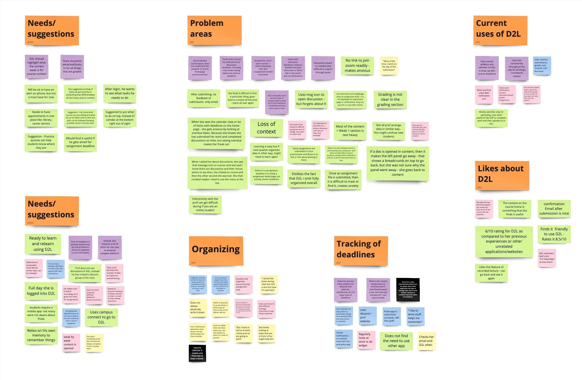
As a team, we compiled all of our data from our interviews and grouped them based on common findings to gain an understanding of emerging themes
Affinity Map
Key Findings
1. The most visited sections of D2L are content, discussions, and grades. Many sections amongst the remaining are undiscovered.
2. Task completion and navigation are time consuming based on structural organization of course content.
3. Text-heavy sections increase cognitive load and cause confusion amongst students.
4. Relying on external platforms, such as Discord and individual course websites, to keep up with coursework and deadlines.
5. Structure of course content on the student-facing interface of D2L varies by professor, causing confusion when navigating.
6. Inconsistent and unreliable notification system, which students have to actively check to stay up to date.
“It takes me a long time to get to the weekly module for my course. There are so many layers to get through.”
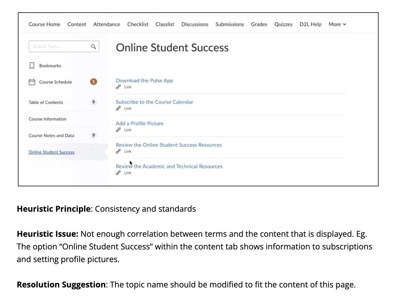
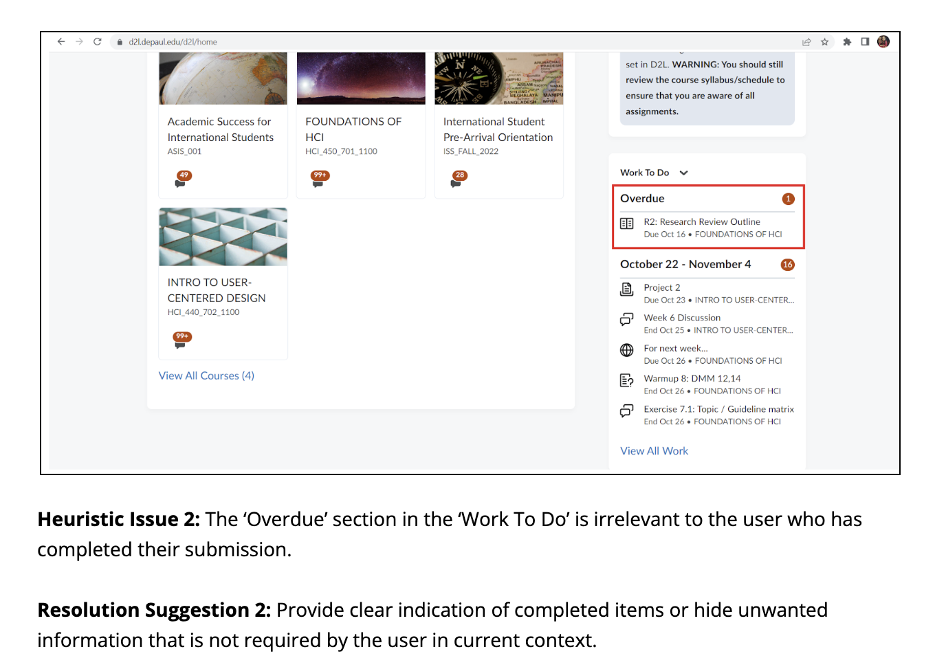
Heuristic Evaluation of D2L
We visited the current D2L portal to understand user interactions and conducted a light heuristic evaluation to identify problem areas and specific issues for our project experimentation.
After analyzing interview findings and conducting a heuristic evaluation, we crafted personas that reflect various user needs and behaviors. These personas guide our website redesign to address real user scenarios effectively.
Personas
Phase 2: Conceptual Design
Requirements for Design
We gathered requirements for our design solutions by clustering related points and creating concepts for the D2L platform redesign. A second affinity map on Miro helped us define the project scope.
-
Easy to access and simple menu items
Relevant and contextual action items with correct system status
Efficient internal linking of sections
-
Clear and consistent indication of user’s location throughout the platform.
Work to Do widget:
Differentiation between courses with deadlines
Correct and contextual information about the items (submissions)
Content section
Correct and automated way of displaying pending tasks
Relevant indication of type of medium
Apt nesting of the left navigation and indication of current course week
-
Consistent and timely notification of deadlines
Website/ mobile notifications for all deadlines and updates (new discussion or announcement made by the professor)
-
A medium to increase interaction between a student and a professor.
Ability to communicate between students.
Problem Scenario 1
Joseph, a busy professional, watches a recorded lecture on D2L after returning from the gym. As an asynchronous student, he faces challenges with communication, waiting for responses to his queries. When his professor's response doesn't trigger alerts, he turns to his classmates' Discord group for help. This experience highlights the importance of seamless communication in online learning platforms for students like Joseph.
Enhance D2L messaging for in-platform communication without needing Outlook.
Add a live chat widget for student-to-student communication.
Improve the 'Work to Do' widget for better organization and task filtering.
Implement external notifications for important course updates and deadlines.
Design Solution
Problem Scenario 2
Hannah, an organized individual, plans her coursework on Friday nights but feels overwhelmed by D2L's 'Work to Do' widget, especially when she sees a new "overdue" section. This leads to anxiety and a frantic call to a classmate for clarification. Her daughter waking up adds to the chaos, dividing her attention. After soothing her daughter, Hannah struggles to navigate D2L to find proof of her submission, highlighting the need for a clearer interface to reduce stress and enhance productivity.
Design Solution
Clear and timely deadline reminders.
Streamlined and interconnected platform navigation.
Customizable quick-access widgets on all pages.
External notification system for important course updates and deadlines.
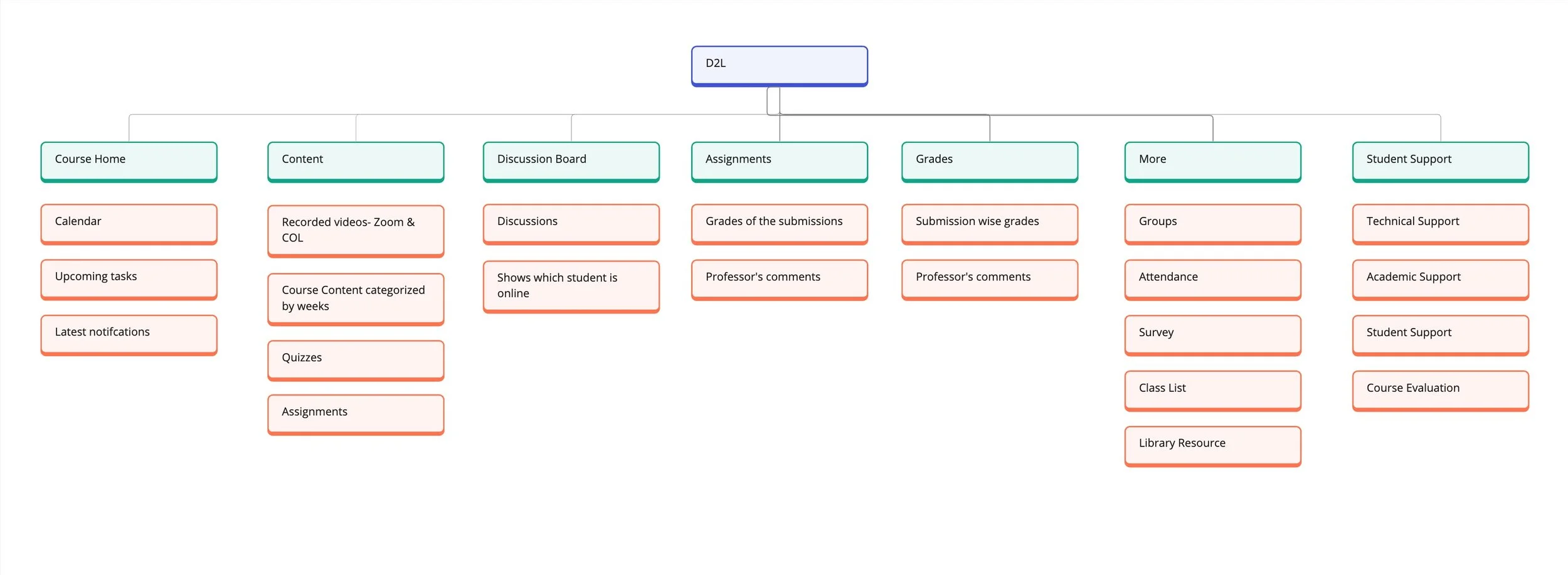
Information Architecture
Before beginning the wireframe prcoess, we created an information architecture to define the hierarchy and structure of our website. We created a site map by combining the options on the menu if they were repetitive and re-structuring the options to create a more intuitive architecture.
Phase 3: Interaction Design
Wireframes
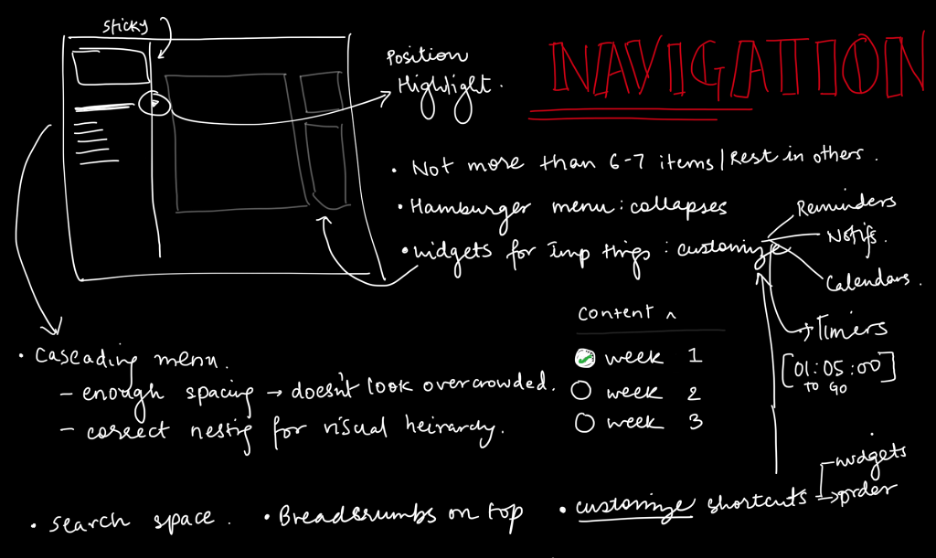
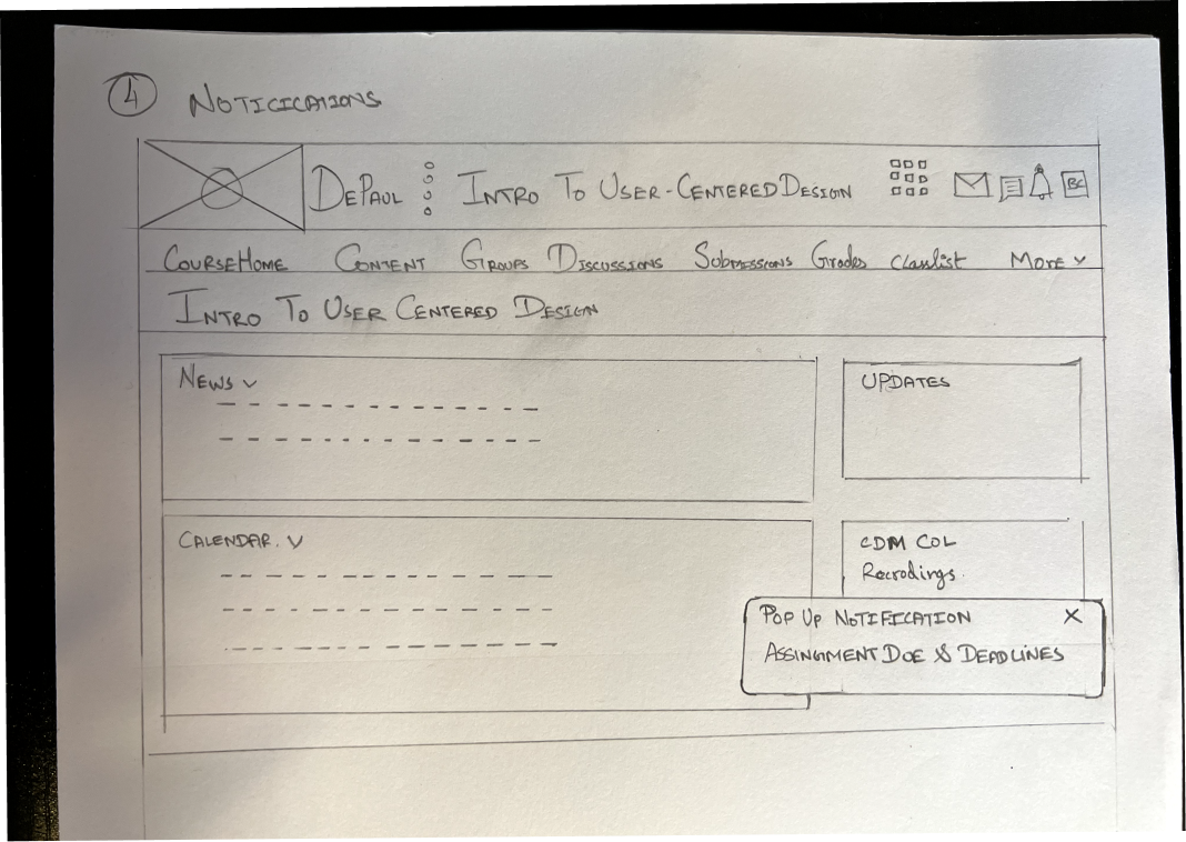
Individually, we developed hand-drawn wireframe sketches that highlight the key elements of our design decisions that we reviewed as a team.
LO-FIDELITY SKETCHES
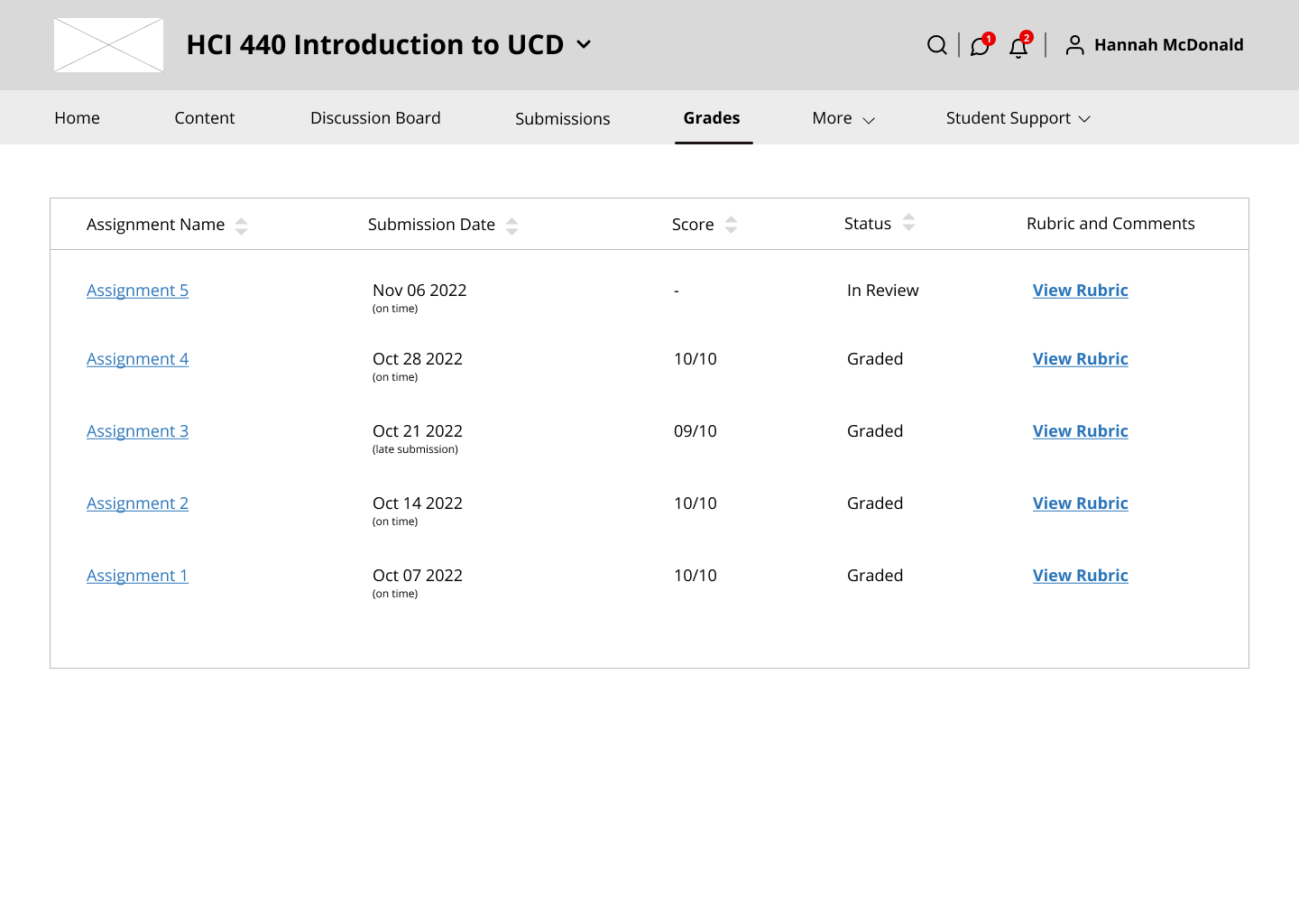
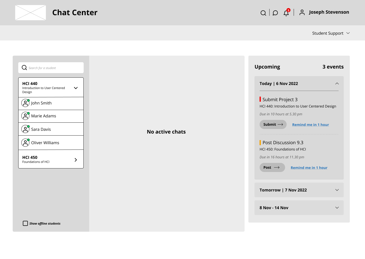
MID-FIDELITY PROTOTYPE
We consolidated our individual sketches into a collaborative series of wireframes that showcase our two personas utilizing an improved redesign of D2L.
Phase 4: Evaluation
Usability Testing
A usability test with eight DePaul students was conducted using our Figma prototype to evaluate the D2L redesign. The test focused on gathering both quantitative and qualitative feedback to understand participant perceptions, likes, dislikes, desired features, and areas of confusion.
Strategy
First-click Testing: The objective is just to see whether the user can tell where to start. Failure to click in the right place first, or taking a long time to click there, suggests that something is wrong with the site's layout.
Task Analysis: We used task analysis to understand how our participants go about achieving the goal of the activity, and how effective and efficient it is.
Findings
7 out of 8 participants found the 'Upcoming' section on the right panel useful for navigating to important pages like assignments, saving time and improving concentration.
2 of the participants initially did not notice the redesigned section.
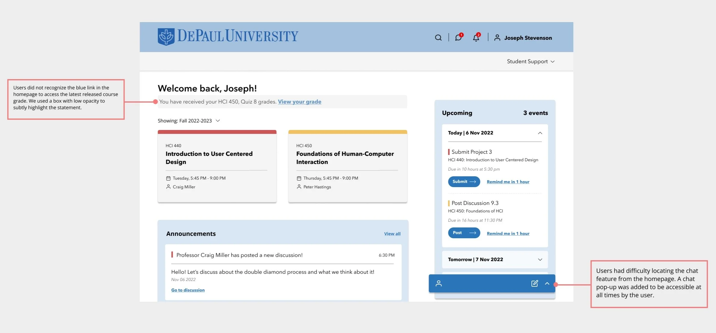
Only 2 out of 8 participants recognized the blue link on the Homepage that directed users to the latest released grade.
3 participants associated the chat icon on the Homepage with a discussion icon due to their prior mental model about D2L
Final Prototype
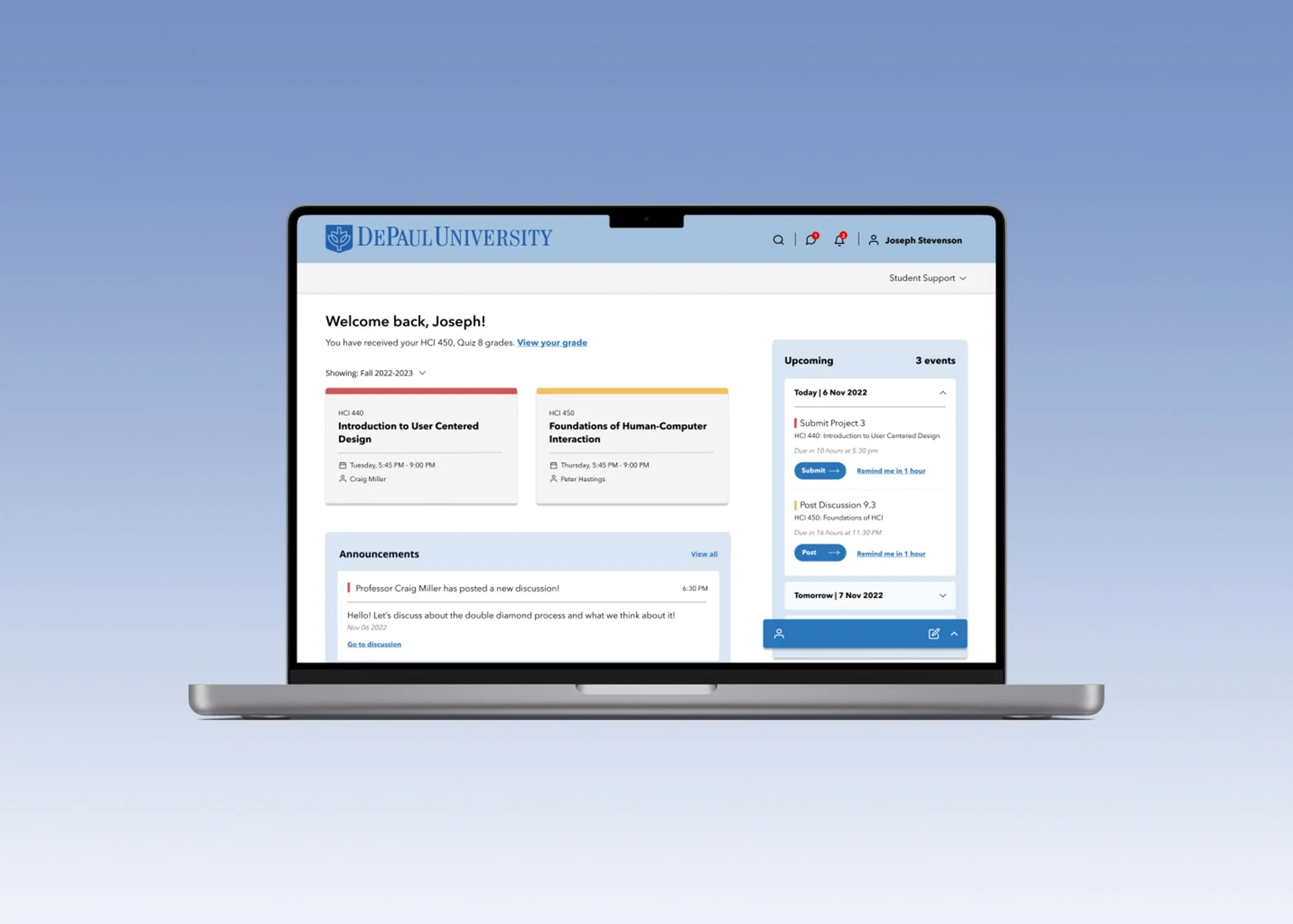
The high-fidelity prototype was developed incorporating design changes identified during the usability test, ensuring a user-centric approach to improve the D2L platform's functionality and user experience.
Future Work
Conduct user testing with the hi-fidelity prototype to gather feedback and validate design decisions.
Implement any necessary revisions based on user feedback and usability testing results.
Conduct a final round of usability testing to ensure the redesigned D2L platform meets user needs and expectations.
